
What to Use When SHAP Is Not Enough: Complementary Tools for Model Interpretation (Part 1)
In my previous blog, “Understanding the Limitations and Pitfalls of SHAP in Personal Auto Insurance,” I discussed several practical limitations of SHAP values using a simulated automobile insurance dataset. My goal was not to discredit SHAP as a tool, but to show when it can quietly break down when it is applied to realistic modeling problems involving correlation, interactions and nonlinear effects. This post picks up exactly where that blog left off.
SHAP is still a useful tool, but it answers a very specific question: How does the model distribute variable contributions for a prediction under a particular set of assumptions? If we ask SHAP to do more than that, we may risk misinterpreting what it is telling us. The real lesson is not to replace SHAP, but to augment it with other interpretation techniques that answer different questions. When we do that, many confusing or misleading SHAP results suddenly begin to make sense.
In this blog, I use a closely related simulated dataset and the Random Forest modeling strategy cited in my previous piece to show how some alternative interpretation tools can complement SHAP to help build a more complete understanding of the model.
For this exercise, I created a personal auto insurance dataset using traditional rating variables such as age, years licensed, a hypothetical variable called “new score,” prior claims, prior accidents, annual mileage, vehicle age and a young driver flag. Additionally, I built into the data a moderate correlation between new score and prior claims variables. Both variables appear informative, but only the prior claims variable has an independent conditional effect on premium in the data-generating process. While this is a hypothetical example to make a point, it does not suggest that the new score variable is unimportant in practice.
A Random Forest model is trained to predict premium, and SHAP values are subsequently computed to interpret that model. In this post, I will examine the correlation case and explore how other tools can help clarify the interpretation for a more robust understanding of the variable importance ranking.
Example 1: Correlated Variables - SHAP vs. Permutation Importance
With moderately correlated variables, SHAP can appear to attribute structure and importance to features that do not have independent conditional effect on the outcome. This happens because SHAP distributes contributions marginally without conditioning on correlated inputs. As a result, SHAP can suggest a given variable is important for the model even when its effect is driven by another, correlated feature.
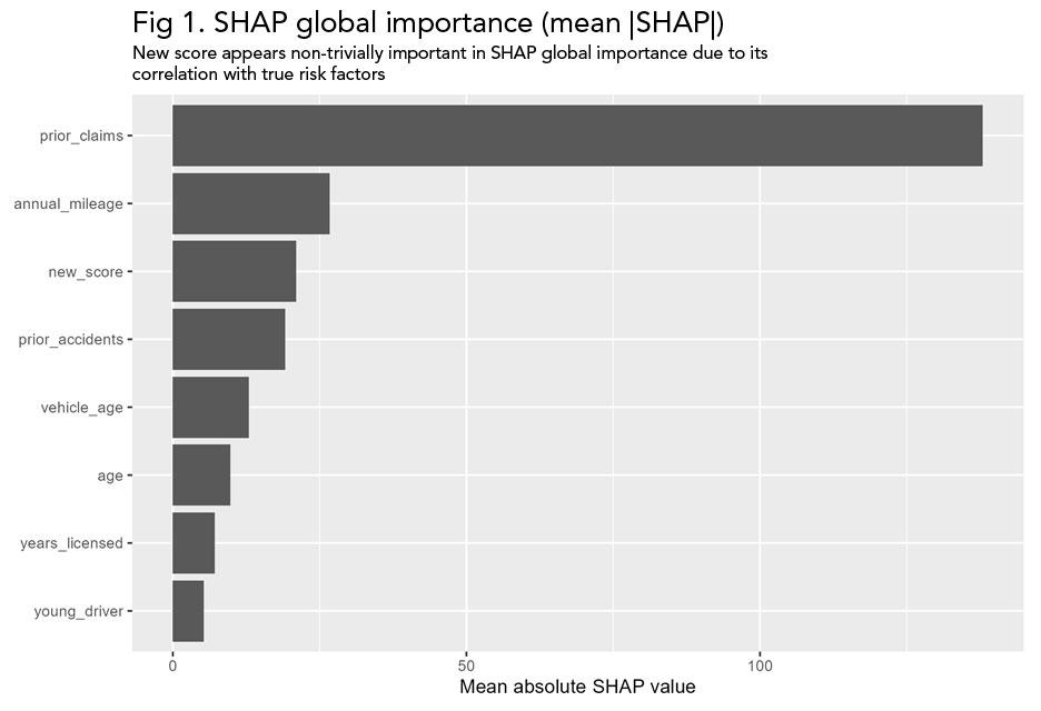
Fig 1. SHAP global importance suggests that new score contributes meaningfully to predictions, despite its lack of an independent conditional effect in the data-generating process.
When we compute permutation importance, a different picture emerges. Permuting the prior claims variable causes a substantial degradation in the model's performance while permuting the new score variable has little effect. This means that the new score variable does not add to the model's predictive value above and beyond the prior claims variable.
Permutation importance measures how much the model relies on a particular variable by breaking its relationship with the outcome and observing how much the model's predictive accuracy deteriorates. The basic idea is that if a variable is important to the model, scrambling its values should make predictions noticeably worse.
When using naive permutation, the values of a single variable are randomly shuffled across observations, while all other variables are left unchanged. This removes any meaningful relationship between that shuffled variable and the model’s outcome, but it also breaks its relationship with correlated variables. As a result, naive permutation can exaggerate the importance of variables that are correlated, because naïve permutation disrupts multiple signals at once.
An alternative approach to naive permutation is blocked permutation, which does not permute variables randomly, but in a way that reflects the correlation patterns. Instead of shuffling a variable completely at random, observations are permuted within groups defined by related predictors. This keeps the relationship across the correlated variables intact but also removes the unique contribution of the subject variable. This way, blocked permutation can better determine whether a variable provides independent predictive information beyond what correlated features already explain.
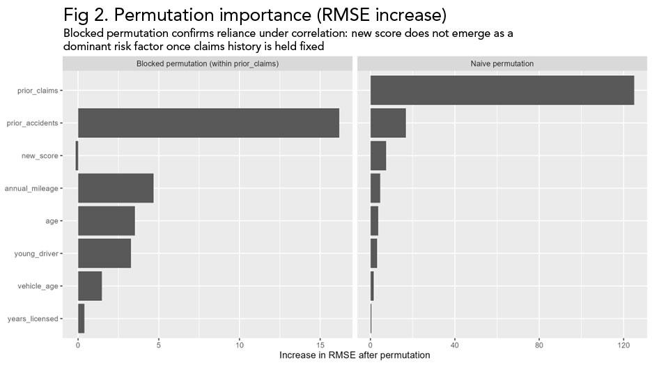
Fig 2. Permutation importance based on RMSE degradation. Permuting prior claims materially impacts predictive performance, while permuting new score has little effect, confirming that new score is not conditionally important.
SHAP is not computationally incorrect in the figure above, but it is misleading if interpreted in isolation as conditional importance. It more accurately shows how the model distributes the contributions across correlated variables, but this does not mean that the allocation is conditionally important. Permutation importance provides the missing context by revealing which variables the model truly depends on.
Example 2: Nonlinear Effects - SHAP Dependence Plots vs. Accumulated Local Effects (ALE) Plots
SHAP dependence plots are often used to visualize how a feature affects the predictions across the variable’s entire range. In uncorrelated settings, these plots can be very informative. When features are correlated, however, SHAP dependence plots can be misleading. The vertical spread seen at a given value on the x-axis often reflects the influence of other correlated variables rather than the noise or influence of the variable itself.
A SHAP dependence plot shows the relationship between a feature’s value and its SHAP contribution across all observations. For each record in the dataset, the feature value is shown on the horizontal axis, and the corresponding SHAP value - representing how much that feature contributes to the prediction relative to a baseline - is shown on the vertical axis.
More importantly, each point reflects an individual prediction and not an average effect. Therefore, the graph referenced in Figure 3 captures the direct effect of the feature as well as any indirect effect of the feature arising from correlations between the tested variable and other variables. This is why the structure in SHAP dependence plots can be difficult to interpret as a pure feature effect.
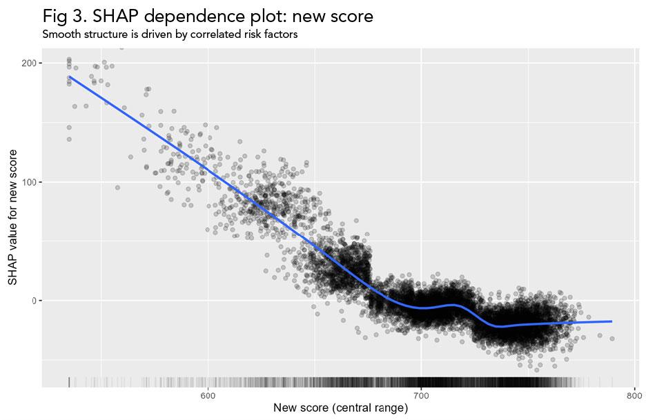
Fig 3. SHAP dependence plot for new score. The smooth nonlinear pattern suggests a strong direct effect, even though new score has no independent conditional effect in the data-generating process.
Accumulated Local Effects (ALE) plots address this problem by isolating the average effect of a feature while also respecting the observed correlation structure in the data. This limitation becomes apparent when we compare the SHAP dependence plot with the ALE plot for the new score variable. ALE removes the apparent structure across the central data range seen in the SHAP dependence plot. The noise at the extreme ends of the variable range is consistent with the sparse data at the tails (shown by the rug plot), so interpretation should focus on where the portfolio density is highest.
ALE plots are designed to show how a model’s predictions change as a single feature increases, while staying consistent with the way the data actually behaves. Instead of asking, “What would happen if we changed this variable to any value we want?” ALE asks a much simpler question: “What happens when this variable moves slightly, in the way it normally moves in the data?”
To do this, the observed range of the feature is split into many small consecutive segments. For each observation, the model’s prediction is calculated twice - once using values at the lower end of the segment and once using values at the upper end of the segment to which the observation belongs, while other variables are left unchanged. The difference between these two predictions captures how the model responds to small increases in the feature, based entirely on values that occur in the data. These small prediction differences are then averaged across all observations and added up across the feature’s range to create the ALE curve.
With correlated variables, the subject variable can first be residualized by removing the part of the variable's effect that can already be predicted from other covariates in the model. In effect, this process asks: “After accounting for related variables, what is left that is unique about this feature?” The ALE plot uses this leftover component, showing a curve that highlights the independent average effect of the variable of interest, instead of getting it mixed up with structures caused by correlations.
This conditional ALE method comes in handy when trying to figure out if a certain pattern really shows an independent effect or it is simply the result of correlated variables. In this example, once the new score is residualized with respect to claims history and other covariates, the ALE plot shows that its remaining average effect is small across the dense center of the data.
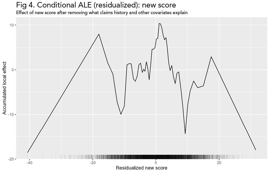
Fig 4. Conditional ALE (residualized): new score. After removing the portion of new score explained by claims history and other covariates, the remaining average effect is small across the dense middle of the data.
This does not mean SHAP is wrong. Rather, it means that SHAP is mixing two things together: the effect of the new score variable and the effect of correlated variables that tend to move with it. ALE helps us answer a simpler question: Holding the data structure intact, how does changing this variable affect predictions on average? In this example, ALE correctly shows that new score has little to no conditional effect, directly contradicting the apparent structure in the SHAP dependence plot. Using SHAP alone in this setting, we would overinterpret apparent complexity. Using ALE alongside SHAP, we see that much of that complexity is an artifact of correlation rather than a true nonlinear effect.
This also does not mean that ALE is superior to SHAP in all respects. ALE provides a clean view of average marginal effects, but it does not explain individual predictions. In other words, ALE is useful for understanding the average effect of a variable across the dataset, but it is SHAP that explains how that same variable contributes to the prediction for a specific observation.
In conclusion, none of these tools are sufficient on their own. Taken together, however, they form a coherent toolkit for interpreting predictive models. When SHAP's results appear confusing or inconsistent, the solution is not to avoid using SHAP entirely but to use a different tool and try to reconcile the answers.
In Part 2 of this blog, I will examine what happens when correlation is not the main issue, but interactions and model structure are. I will delve into several examples where the model learns variable interactions, and will show how to distinguish between real patterns and artifacts of the data or the modeling approach.
News & Insights

How the Insurance Industry is Navigating the Complex Debate Over Fairness in Pricing

Keeping It Clean: Understanding Pollution Liability Insurance and Its Future

Not Another AI Panel: Notes from the Bermuda Captive Conference
